Monday, September 29, 2008
Type Face..
Here are five type faces that I truly enjoy or truly do not enjoy:
1. Rockwell. I think that Rockwell is a great type face to use for research papers and other such documents that are read on a daily basis. It is a very plane type face that is easier to read because it doesn't draw too much attention to the actual letters, but the the words and sentences themselves.
2. Ariel. This type face is very similar to Rockwell in that it is easy to read and doesn't draw too much attention to the individual letters.
3. Myriad.This is another typeface that is just like all the other typefaces out there that are used for word documents and research papers. This type face is not my absolute favorite though.
4. Bleeding Cowboys. This was the one typeface that I could remember that was just a plane basic type face like all the others I chose. It's very intricate and attention grabbing. It is a great type face for catching someone's eye and relaying a brief, to-the-point message. It is not, however, a good type face to use when writing long documents. Because it would hurt your eyes. This typeface has a lot of decorative lines coming off of all the upper-case letters. They are unnecessary for reading the type face, but they do help grab the attention of the reader.
5. Helvetica. Yet another boring typeface.. This is another one of those type faces that I just chose because I could remember how to spell it. But it is my number one choice of type face when it comes to typing up papers and sending emails!
The world of type face is still fairly new to me. Despite the fact that I have been using type faces my whole life, I have never really thought in detail about what all "type face" entails. But I look forward to becoming more familiar with many different typefaces and even creating my own...
Monday, September 1, 2008
Five Graphic Designers...
-Rob Janoff is best known for being the designer of the Apple Computers logo. But he has done a few other corporate logos as well. I like how in this design, Janoff chose to use this many colored, horizontal stripes with such a simple basic design. He took something basic in nature, and turned it into a logo representing some of the most complicated things in life. The logo is believed to be based off either the eating of the forbidden fruit (which led to the knowledge of man) or the story of Alan Turing, who was killed by eating an apple laced with cyanide.
-Dave Keller is currently a New Media Design student at the Academy of Art University in San Fransico, California. I chose to write something about Dave because I really enjoy his work and what he does. I also chose him because he is a big influence in my life. This is a two spread magazine layout about himself that he designed. I know its not a logo or even the best example of typography, but I really like the use of space and the way he used the images on the page to help balance everything.
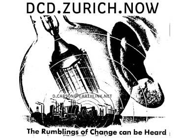
-I really enjoy this design done by David Carson. It's a design for a studio he opened in europe. I like how all the objects in this image are pointing back to the focal point in the center, which just keeps drawing your eye outward. This is a powerful piece to me which demonstrates exactly what Carson is thinking. He is confident that his work will have a major impact on the world around him, and that he is going to change the way people think about graphic design.
-Tibor Kalman is not the type of designer that strives to inform the public of current social issues. In this design for an umbrella, Kalman cleverly demonstrates optimism. I like the contrast between the outside of the umbrella and the inside of the umbrella, I think it further assists in creating the feeling of optimism. Not only does this design help cheer people up when the weather is miserable outside, it's also very functional.
I really like this image that Saul Bass did for the 1984 Olympic games in Los Angeles. I think it captures one of the most important ideas experienced throughout the whole olympics... striving to do what no other has yet done. This image has a very well balance between the negative and the positive space. In this poster, the olympian seems super-natural, which is basically how many people view the real athletes of the olympics.
Why I want to become a graphic designer...
Ever since I was young, I have loved art. But now that I'm getting older, I have decided that I need to start considering what I want to do for the rest of my life. So that's why I'm majoring in graphic design. I made up my mind that no matter what I ended up doing for a living after school, it would have something to do with art. I chose graphic design because it was something I have always wanted to do. The idea of designing logos, labels, advertisements, or anything like that and having it seen and/or appreciated by others has always appealed to me. I'm also inspired by the art I see around me everyday, and by certain people that I am close to.
Subscribe to:
Posts (Atom)